

Equinox makes the proof to press match a lot more predictable and accurate, which is essentially what everybody strives for: to make everyone successful – the separator, the printer and the brand owner, who is the ultimate benefactor because they get accurate brand colors. Even the printer and the separator are benefactors because they ultimately get more business from a satisfied customer.
Director of Color Technologies at Beck Atlanta
For over 100 years, Beck has been leveraging the power of beauty to drive their business. They consider themselves a boutique B2B company providing graphic files for print reproduction that enables consistently beautiful imagery on shelf, outdoor and point of sale. Beck customers desire to meet the highest quality color reproduction needs to help make the brand pop consistently.
Beck has done this with what they call the Beck Advantage. Over the years they have developed a compact, condensed, coordinated graphic workflow that reduces steps and maintains consistency. Their compression process shortens cycle times, raises quality, and provides significant improvements in speed to market. With this, they have become a pioneer and innovator in creating beauty throughout the entire color process and across all mediums. Their team of proactive, consultative thinkers shares a deep passion for their clients’ brands as portrayed in beautiful packaging on shelf. “We’re fanatically committed to enhance brand images better than anyone else,” enthuses Dennis Smith, Beck EVP/COO. Yet, Smith is quick to point out that everyone in the industry can approach business this way—and similar processes can benefit all of us in the industry.
Limit the rules
Brand owners invest a lot of money in focus groups to make sure they connect with a package. When they see how it can die through the printing process, it can be disappointing. Often they discover that they do not get the same impact due to the loss of the intensity of color and the intent of the reproduction process—or were just limited by the technology.
“How can any of us make people more creative? That’s a difficult question,” ponders Gary Brown, VP, Process Consultant. “But, we all know how to make people less creative. Just impose more rules. So, when we are asked how to make people more creative, we just impose fewer rules. That will free designers to focus all their attention into what they want to create for the brand.”
For the most part, the flexo community has found it necessary to teach designers to design to flexo. Historically this has included, among other factors, the number and specific set of colors that a designer can work with; the inability to fade vignettes to zero; the reluctance to create drop shadows; and the inability to blend colors in vignettes, shades and textures. Beck considers that backwards. What the industry has needed to do is introduce technology to let designers design for the brand, rather than for flexo.
Beck’s approach begins with understanding what kind of end result is expected from its clients. They try to define and quantify what beauty is. They measure the difference between the artwork that is sent to them and what they finally deliver — what the printer ultimately reproduces. Beck’s enhancement—what they provide—is their intent to ensure that beauty or maximum optimization of design intent is not lost. They attempt to intensify what is technically feasible to visually connect to the brand. If, with color, definition and vibrancy, they can enhance what is possible to be reproduced so that their clients’ packaging is different than everything else on the shelves, they have done their jobs.
“The better you understand the process, the more you are able to expand the enhancements. We use the process to limit the amount of rigid rules. Our process allows designers and printers to expand the opportunity for great packaging,” explains Jeff Hall, Quality & Color Process Manager.

For example, by utilizing their expertise in Expanded Color Gamut (ECG) separation with state of the art expanded gamut prepress software, Beck is able to free designers from the restriction that the number of colors they use must not exceed the number of ink decks on the printing press. ECG has allowed Beck to tell the designers to use virtually any number of colors. Designers can narrow in to what they are looking for in terms of color intent. They’re no longer designing large billboards of spot colors. Their packaging can be more organic in nature, fading in and out of colors. This type of design allows the package to emote more of a feeling than an advertisement.
“The goal is to completely free the designer,” says Mark Causey, Director of Color Technologies at Beck. “We’re not 100% there, but, by using this process and technology, we’re closer than a few years ago—in fact, light years closer than just two to three years ago.”
The printer is an important partner in the color development workflow
While Beck’s mission is to help the brand owner make an emotional connection to the consumer. Beck’s strategy is to introduce technologies to tear down the rules, or the limits of the rules.
With all of this attention to the brand owner, it is significant to remember that Beck is a staunch advocate for the printer. According to Beck, it is a partnership between the brand owner, Beck and the print supply chain — using advanced technology — where everyone wins. They can be successful with the brand owners but, if they do not get ‘buy in’ from each stakeholder on the parameters to achieve the design, they will never get the desired end product. Beck realizes they must give printers the tools to understand technologies like high definition flexo. They work with printers to improve the processes to adapt to this new evolution of design.
“It truly is a consultative partnership. We often encounter resistance and uncertainty from printers when introducing them to our process, technology and methodologies. However, once they live it, it’s an easy sell. We know that the printer must ‘win’ as well,” says Hall. “We spend a lot of time making the printer feel comfortable about the process.”
Beck outlines to the printer the key performance factors that will be needed to achieve success, such as fades to zero and consistent, impactful solids. Then they work together to determine how to accomplish it with technologies like ECG and high definition flexo. They find that when they suggest an ECG process, people are uneasy at first, printing color with color. They are concerned that Beck will be unable to create accurate separations without press tests and trials—and they are not necessarily comfortable with proof to press matches due to negative experiences in the past.
Beck outlines to the printer the key performance factors that will be needed to achieve success, such as fades to zero and consistent, impactful solids. Then they work together to determine how to accomplish it with technologies like ECG and high definition flexo. They find that when they suggest an ECG process, people are uneasy at first, printing color with color. They are concerned that Beck will be unable to create accurate separations without press tests and trials—and they are not necessarily comfortable with proof to press matches due to negative experiences in the past.
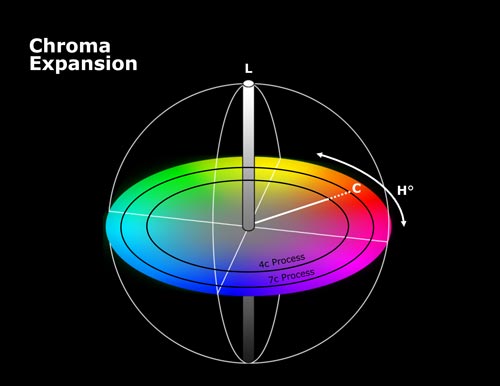
Printing with seven colors increases the color gamut about 70 percent over 4-color process. Beck Atlanta attests that with the larger gamut it achieves greater stability, with a nicer, cleaner, higher chroma image.
Beck walks printers through their workflow and explains the how the technology they use will help alleviate their concerns. Printers fret over dirty print in the highlights. Beck explains how they use high definition flexo and new plating technologies. MicroCell screening strategies offer a more consistent, clean sheet on wide web. Even the plates, themselves, have improved. Then, with proofing, Beck has developed a process to get to color data—including linearization, fingerprint and confirmation.
As expected, proofing plays an enormous part in the process. A good amount of testing and fingerprinting is conducted up front to understand color gamut and how the printer is printing. It’s done so, by the time they get on press and reach their correct densities, they ‘are there’. “If you can show a customer a proof of what they expect, then compare it to the printed result and show that it actually matches, the credibility of what we offer is enormous with printers. I do not like press trials to get to color. I prefer to gather as much information in the fingerprinting process and let our proofs set the expectation. Then, when printers run their first press trial, they are excited,” comments Causey. “It is more about proving the end product—when they see they match to the proof, as we promised.
Communication is key. Beck articulates the process from the client’s and converter’s perspectives. They explain in advance what everyone will be seeing each step of the way, setting expectations up front and detailing what they can guarantee. Once the brand owner sees better than expected results compared to past experience, that’s when everyone wins.
You have to manage color from concept all the way to the shelf. According to Beck, they can make great looking TIFFS, but if the process as a whole is not managed, they are never going to get the results they want. It is vital to manage the color downstream on every press run.
When done right, not only is print quality improved, but productivity as well. “We can help reduce press setup and downtime when changing from job to job,” adds Brown. “Brand owners are changing the way they market to the consumer and it is forcing a change in the print industry. Long runs are less frequent than in the past. There are lots of short runs due to specialty designs created by the brand owner to keep the consumers’ attention. There are many design changes.”
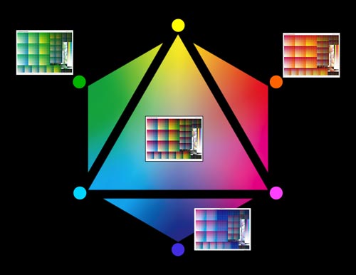
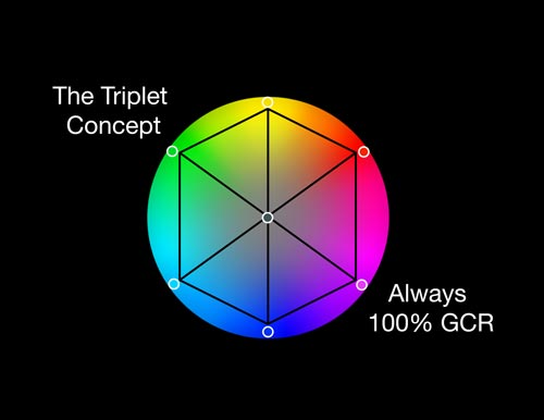
In 7-color printing – adding orange, green and violet to CMYK – colors are cleaner. It’s the Triplet Concept. looking at a hue wheel, every color influences only one-third of the hues. For example, cyan influences 100 percent of the colors in a CMYK model, but only 33 percent of the color when you add OGV.
Enabling technologies to facilitate creativity
If the ultimate objective is to eliminate flexo rules to free the designer to focus on creativity—while offering each printer the tools to make it happen, cost effectively—there needs to be technologies in place to make this happen.
Beck has been able to weave many new prepress technologies to help eliminate flexo rules and, in the process, help to reproduce brand intent. Two of the technologies that have made a very significant impact to the Beck process and reaching brand goals are ECG (or multi-color printing) and high definition flexo. With these technologies, screens are able to fade to zero, and designers have an almost infinite number of colors to work with.
“Color is the core of what we do,” notes Hall. “If you do not have a measurable color management process to help converters stay on track, you are not going to reproduce print on a consistent basis.”
Extending the tonal range
In the past couple of years, the technology that manages multi-color printing to provide ECG has been considerably enriched. It is more economical, and images look better than ever.
The Triplet Concept applies to spot colors, as well as images. A Pantone 185 red, for example, is far more stable when
built with orange and magenta than with yellow and magenta, because orange is closer to Pantone 185 than yellow is.
It used to be common belief that there was no benefit to printing with seven colors to match a 4-color image. Now it is proven that printing with seven colors is more stable.
While it is certainly true that printing with CMYK will cover a reasonable gamut, printing with seven colors extends it considerably more. What printers realize quickly is that while certain tint builds will not perfectly match all Pantone colors, they do become their own color standards. When they show these standards to a customer while assuring that they can always match those colors, the entire process is more stable. While they may not be able to match a Pantone 186 red by mixing an ink, the printer and the designer can agree that their tint build to that color will always be very close—and always, consistently, the same. The reason is quite simple. The printer is using the same inks and tooling on every job. If the designer knows that up-front, there is no problem. The printer is not blending inks in a kitchen before every new job—which has its own variations. Nor, are they mixing and matching different aniloxes or chemistries. Even press settings can remain the same with ECG printing. Most printers will assert that they are more consistent with ECG printing than with either four-color process or with spot colors. They can also get to color faster on the press.
Printing with seven colors increases the color gamut about 70% over four color process.
Beck Atlanta attests that with the larger gamut they achieve greater stability, with a nicer, cleaner, higher chroma image.
In seven-color printing, adding orange, green and violet to CMYK, colors are cleaner. It’s the triplet concept. Looking at a hue wheel, you can see that every color influences only 1/3 of the hues. For example, cyan influences 100% of the colors in a CMYK model, but only 33% of the color when you add OGV. Cyan drops out of 2/3 of the color space. This means that colors that get dirty or muddy, such as oranges and reds, remain clean. The triplet concept applies to spot colors as well as images. A Pantone 185 red, for example, is far more stable when built with orange and magenta than with yellow and magenta, because orange is closer to Pantone 185 than yellow is.
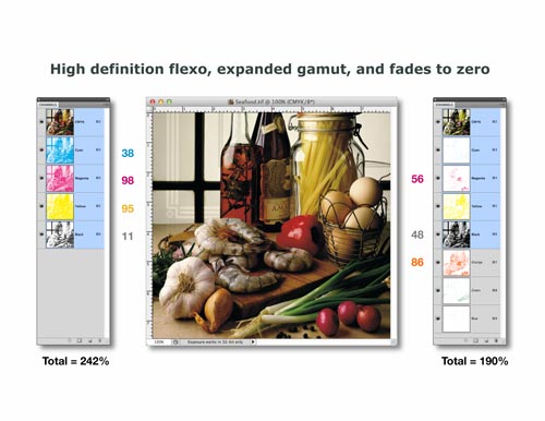
It used to be common belief that there was no benefit to printing with seven colors to match a 4-color image. Now it is proven that printing with seven colors is more stable. The second note is that it costs more to print an image with four colors than with seven colors, when the press is set up that way, completely, on a daily basis. You can see that 22% less ink is used to match the image (below), because less ink colors are needed to create each tonal build.
With ECG printing, 22 percent less ink is used to match the image since fewer ink colors are needed to create each tonal build. Printers are impressed with the economics in the pressroom with a fixed ECG ink set. With a fixed ink set, makereadies are faster and a printer can run multiple products in the same run – and get better quality along with extended chroma.
Beck creates Equinox profiles from ICC profiles. They are used for both their separation and proofing strategies.
For separations for press, Equinox is able to identify and maximize the use the gamut of the press to identify the range of potential colors.
A huge strength is the proof of the press match. Equinox can use a digital proofer’s inkset—which is generally a limited industry standard—and color manage those inks to where a very large percentage of Pantone colors are achievable for color matching. “With Equinox we create a proofing profile from the fingerprint of the press that very accurately matches the approved expectations for the press run,” explains Causey. “This is much better than in the past, when we created proofs and separations that relied on some guesswork. Now, with Equinox, we are able to accurately calculate colors with much more precision.”
“Equinox makes the proof to press match a lot more predictable and accurate, which is essentially what everybody strives for: to make everyone successful—the separator, the printer—and the brand owner, who is the ultimate benefactor because they get accurate brand colors,” comments Causey. “Even the printer and the separator are benefactors because they ultimately get more business from a satisfied customer.”
Printers are impressed with the economics in the pressroom with a fixed ECG ink set. There is not as much ink used, units are not swapped with different inks, and makereadies are faster. In addition, while there could only be one product per press run due to specific spot color requirements, with a fixed ink set a printer can run multiple products in the same run—and they get better quality along with extended chroma.
A plate technology that expands the gamut
Much of the ECG is due to high definition flexo technology. By providing a fade to zero, high definition flexo offers an extended option of colors that were previously not available, by the nuanced tones that are now reproduced in the highlights and the shadows.
The ability of producing smoother tints also allows the art director to work more comfortably with design components such as vignettes and drop shadows—something extremely difficult to reproduce just a few years ago.
Advances in high definition flexo provide both better solids as well as better highlights. The advantages of round top and flat top dots are better understood today than ever before. In general, round top dots provide better highlights, while flat top dots provide better solids. New plate imaging technologies which incorporate the plate exposure source in the CTP device enable plates to have round top dots in highlights and flat top dots in shadows – providing the best of both technologies in the same plate.
So, ultimately, there are lighter highlights, stronger solids, and the ability to extend the 7-color gamut even further—but with the stability that printers require.
In summary: With enabling technologies, limiting the rules extends the designer’s creativity
Beck is keen to the experience of the process. Everyone involved in the supply chain process needs to have a good experience. The brand owner is creatively limited when told that something is not possible. Nor does the printer want to be pushed into a process it is uncomfortable with. By using a process intertwined by great engineering and enabling technologies, Beck can offer a good clean process and experience, where everyone feels good about their contributions and their connection to a project. Meanwhile, innovative technology is leveraged to lower costs and to provide a repeatable, consistent result.
With this, Beck is able to deliver the client’s brand beautifully, safely, and realized—every time and in every medium. The process is perfect from the start and issues are prevented before they even manifest themselves. And, the right people do the right things in the appropriate sequence. Finally, the approach uniquely provides relevant data to measure performance.
It’s a process that limits the rules that designers must subscribe to.
It’s a process that is also a thing of beauty. “Beauty enhances the pleasing qualities of products. When we do our job, our clients see their displays pull consumers, and their packaging jumps off the shelf,” summarizes Smith. “They are able to create designs that intrigue, and advertising that compels, helping business to thrive.”